
UNA COURSEWORK
Marketing & Design

Sparrow is a PR agency concept designed as an Entrepreneurial Marketing course exercise. The designs in this presentation include brand guidelines and standards.

Sparrow combines two words: "spar" and "arrow," subtly referencing the key to good PR: using words with precision. The sparrow in-flight represents forward motion.
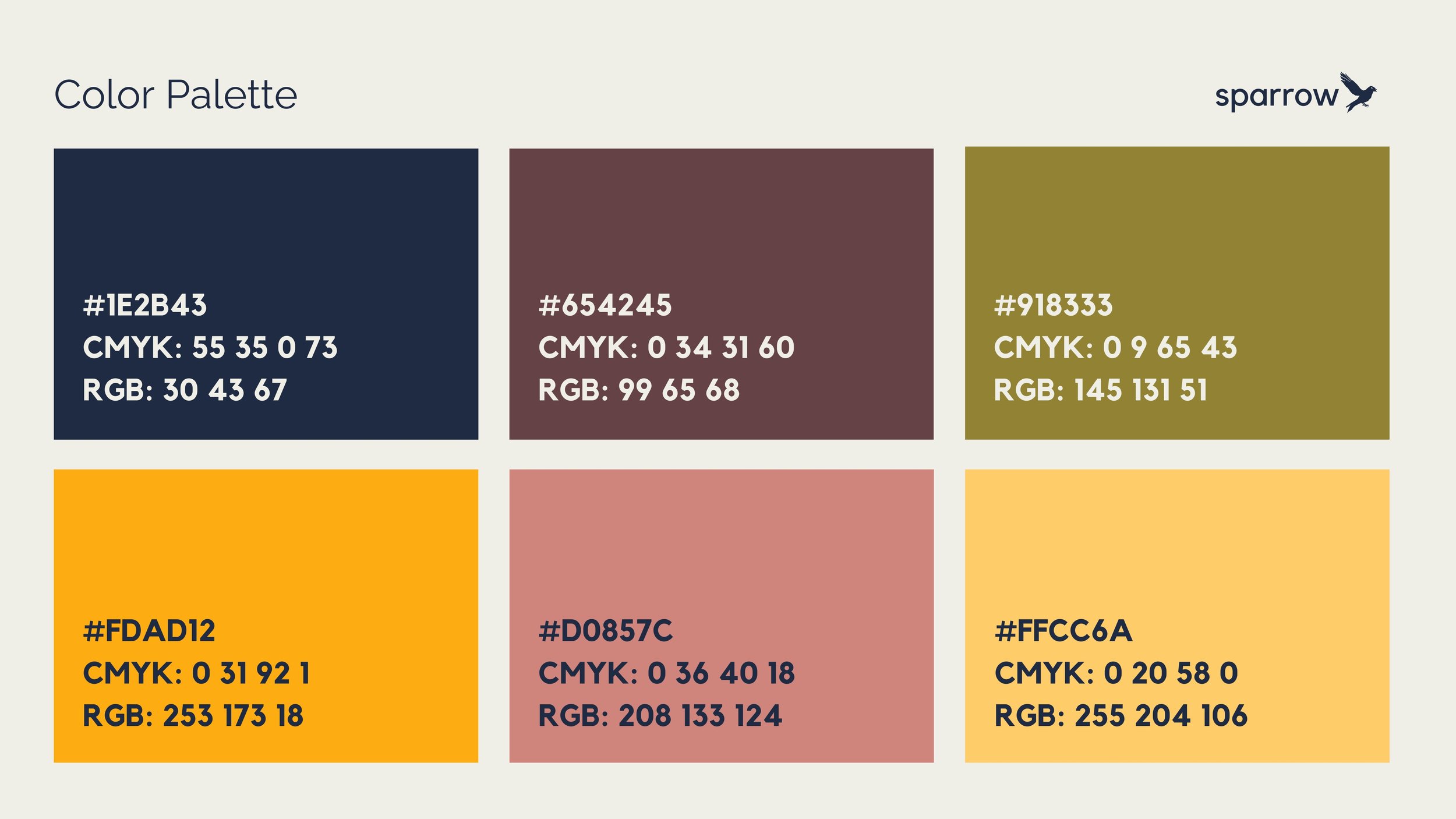
This color palette is comprised of playful, natural, and bold tones that evoke a sense of wonder paired with refined style--values that form the basis of Sparrow.

Sparrow believes in the power of meaningful brand-audience relationships, and this is why our clients soar. Our media and marketing skills position your brand for success.

Business cards should convey your brand's mission and your personal expertise in one quick glance. These concise and well-designed business cards do just that.

Business cards should convey your brand's mission and your personal expertise in one quick glance. These concise and well-designed business cards do just that.

This font family provides a distinguished look for a variety of uses. Kollektif & Raleway pair well for a professional, modern sans serif look, with Limestone providing a light-hearted flair.

These mock-ups show the versatility of the Sparrow brand across varied physical marketing pieces. The logo, tagline, colors, and fonts translate well on several merchandise items.

This logo variant shows the design without the varied colors seen in the original logo. This is a usual visualization for watermarks, small logo placements, and discreet links.

New Market is a brand concept conceived as part of a Digital Marketing course exercise. This presentation includes brand guidelines, product mock-ups, and digital marketing graphics.
The New Market Logo is versatile, minimalistic, and striking. The name's meaning is up to interpretation and leaves room for a product lineup expansion.

New Market totes come in three color offerings: slate blue, classic black, and deep green.

#whatsinyourtote embraces viral marketing by encouraging user-generated content (UGC). The tagline and wallpaper emphasize the stripped-back nature of this brand.

The color palette is designed with a natural aesthetic in mind, speaking to the brand's sustainable production. The fonts are impactful and versatile.

These social media ads are designed for Instagram and Facebook with two goals in mind: (1) showcase the product and (2) encourage audience participation.

These story-optimized ads fit seamlessly into the timeline/feed of the average member of NM's target audience while positioning the bag as sustainable and tactile.

These display ads are discreet enough not to detract from the user's online experience while striking enough to draw the viewer closer to our brand.